Beyond creating a mixing hierarchy, color theory also provides tools for understanding how colors work together.
Monochrome
The simplest color interaction is monochrome. This is the use of variations of a single hue. The advantage of using a monochromatic color scheme is that you get a high level of unity throughout the artwork because all the tones relate to one another. See this in Mark Tansey’s ‘Derrida Queries de Man’ from 1990.
Analogous Color

Oliver Harrison, Analogous colors: red-orange, orange and yellow-orange
Analogous colors are similar to one another. As their name implies, analogous colors can be found next to one another on any 12-part color wheel.
Common analogous colors can be found by taking one tertiary color and one of the secondary colors used by it when creating that tertiary color. Here are some examples, using traditional color theory:
- purple/blue-purple.
- green/yellow-green.
- orange/red-orange.
Analogous color schemes are used when a subtle color change is needed. You can see this effect in Paul Cezanne’s oil painting, Auvers, Panoramic View.
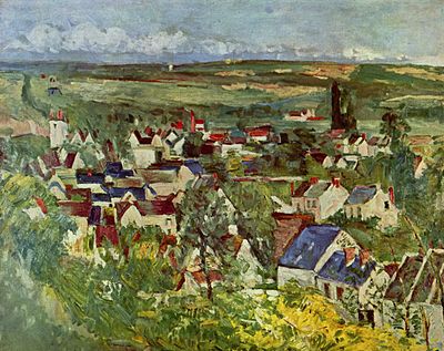
Paul Cézanne, Auvers, Panoramic View, 1873-75. Oil on canvas, 65.2 x 81.3 cm, Art Institute of Chicago, Chicago
Color Temperature

Oliver Harrison, Sets of warm/cool pairs
Colors are perceived to have temperatures associated with them. The color wheel is divided into warm and cool colors. Warm colors range from yellow to red, while cool colors range from yellow-green to violet. You can achieve complex results using just a few colors when you pair them in warm and cool sets. A warm/cool scheme uses two pairs of analogous colors; one warm pair and one cool pair.
Complementary Colors

Oliver Harrison, Blue and orange are complementary colors.
Complementary colors are pairs of colors that, if added, would produce complete color saturation—white or black depending on the type of mixing you’re doing. Complementary colors are found directly opposite one another on a color wheel.
Common complementary colors can be found by taking one secondary color and the primary color not used when creating that secondary color. Here are some examples, using traditional color theory:
- purple/yellow.
- green/red.
- orange/blue.
- white/black.
Though they are not represented on the color wheel, adding white to black will always result in complete color saturation regardless of mixing method.
When placed near each other, complements create a visual tension. This color scheme is desirable when a dramatic effect is needed using only two colors. The painting Untitled by Keith Haring is an example. You can click the painting to create a larger image.

Oliver Harrison, Split complementary colors
A split complementary color scheme uses three hues, one color, and two others that are on each side of that hue’s complement on the color wheel. Like the use of complements, a split complement creates visual tension but includes the variety of a third color.
Color Subtraction

Oliver Harrison, A color subtraction example where the same orange hue appears more yellow against a red background
This is a visual phenomenon where the appearance of one color will lessen its presence in a nearby color. For instance, orange (red + yellow) on a red background will appear more like yellow.
Simultaneous Contrast

Color value comparisons

Oliver Harrison, Simultaneous contrast
Neutrals on a colored background will appear tinted toward that color’s complement, because the eye attempts to create a balance. (Grey on a red background will appear more greenish, for example.) In other words, the color will shift away from the surrounding color.
Also, non-dominant colors will appear tinted towards the complement of the dominant color.
Color interaction affect values, as well. Colors appear darker on or near lighter colors, and lighter on or near darker colors. Complementary colors will look more intense on or near each other than they will on or near grays (refer back to the Keith Haring example above to see this effect).
Understanding color
Color is the most profound element in visual art because it can affect the outcome of a work in so many ways. Humans respond to color combinations differently, and artists study and use color in part to give desired direction to their work.
Color is fundamental to many forms of art. Its relevance, use and function in a given work depend on the medium of that work. While some concepts dealing with color are broadly applicable across media, others are not.
The full spectrum of colors is contained in white light.
Humans perceive colors from the light reflected off objects. A red object, for example, looks red because it reflects the red part of the spectrum. It would be a different color under a different light. Color theory first appeared in the 17th century when English mathematician and scientist Sir Isaac Newton discovered that white light could be divided into a spectrum by passing it through a prism.
The study of color in art and design often starts with color theory. Color theory splits up colors into three categories: primary, secondary, and tertiary.
The basic tool used is a color wheel, developed by Isaac Newton in 1666. Another model, the color tree, was created by Albert Munsell. It has a spectrum made up of sets of tints and shades on connected planes.
There are a number of approaches to organizing colors into meaningful relationships. Most systems differ in structure only.
Traditional Model
Traditional color theory is a qualitative attempt to organize colors and their relationships. It is based on Newton’s color wheel, and continues to be the most common system used by artists.
Traditional color theory uses the same principles as subtractive color mixing (see below) but prefers different primary colors.
Primary
Colors red, blue, and yellow. You find them equidistant from each other on the color wheel. These are the “elemental” colors; not produced by mixing any other colors, and all other colors are derived from some combination of these three.
Secondary
Colors orange (mix of red and yellow), green (mix of blue and yellow), and violet (mix of blue and red).
Tertiary
Colors obtained by mixing one primary color and one secondary color. Depending on amount of color used, different hues can be obtained such as red-orange or yellow-green. Neutral colors (browns and grays) can be mixed using the three primary colors together.
Black and White
Lie outside of these categories. They are used to lighten or darken a color. A lighter color (made by adding white to it) a tint, while a darker color (made by adding black) is a shade.
Color Mixing
A more quantifiable approach to color theory is to think about color as the result of light reflecting off a surface. Understood in this way, color can be represented as a ratio of amounts of primary color mixed together.
Additive color theory is used when different colored lights are being projected on top of each other. Projected media produce color by projecting light onto a reflective surface. Where subtractive mixing creates the impression of color by selectively absorbing part of the spectrum, additive mixing produces color by selective projection of part of the spectrum. Common applications of additive color theory are theater lighting and television screens. RGB color is based on additive color theory.
Subtractive color theory (“process color”) is used when a single light source is being reflected by different colors laid one on top of the other. Color is produced when parts of the external light source’s spectrum are absorbed by the material and not reflected back to the viewer’s eye. For example, a painter brushes blue paint onto a canvas. The chemical composition of the paint allows all of the colors in the spectrum to be absorbed except blue, which is reflected from the paint’s surface. Subtractive color works as the reverse of additive color theory. Common applications of subtractive color theory are used in the visual arts, color printing and processing photographic positives and negatives. The primary colors are yellow, cyan, and magenta (yellow, blue and red).
Attributes
There are many attributes to color. Each one has an effect on how we perceive it.
Hue
A hue is a pure, spectral color. Black and white are not hues.
Saturation
Color saturation refers to the purity and intensity of a color. The primaries are the most intense and pure, but diminish as they are mixed to form other colors. The creation of tints and shades also diminish a color’s saturation. Two colors work strongest together when they share the same intensity. This is called equiluminance.
Value
Color values range from low key (very dark) to high key (very light). Yellow is the hue with the lightest value, while violet is the darkest. There are a few color schemes that collectively offer the same color illusion.
The value of a color can make a difference in how it is perceived. A color on a dark background will appear lighter, while that same color on a light background will appear darker.
Left is a color/value relationship with the same central color against a dark and light background. The work of Josef Albers is a protracted study in color relationships.
Color Interactions
Beyond creating a mixing hierarchy, color theory also provides tools for understanding how colors work together.
Monochrome
The simplest color interaction is monochrome. This is the use of variations of a single hue. The advantage of using a monochromatic color scheme is that you get a high level of unity throughout the artwork because all the tones relate to one another. See this in Mark Tansey’s ‘Derrida Queries de Man’ from 1990.
Analogous Color
Analogous colors are similar to one another. As their name implies, analogous colors can be found next to one another on any 12-part color wheel.
Common analogous colors can be found by taking one tertiary color and one of the secondary colors used by it when creating that tertiary color. Here are some examples, using traditional color theory:
Analogous color schemes are used when a subtle color change is needed. You can see this effect in Paul Cezanne’s oil painting, Auvers, Panoramic View.
Color Temperature
Colors are perceived to have temperatures associated with them. The color wheel is divided into warm and cool colors. Warm colors range from yellow to red, while cool colors range from yellow-green to violet. You can achieve complex results using just a few colors when you pair them in warm and cool sets. A warm/cool scheme uses two pairs of analogous colors; one warm pair and one cool pair.
Complementary Colors
Complementary colors are pairs of colors that, if added, would produce complete color saturation—white or black depending on the type of mixing you’re doing. Complementary colors are found directly opposite one another on a color wheel.
Common complementary colors can be found by taking one secondary color and the primary color not used when creating that secondary color. Here are some examples, using traditional color theory:
Though they are not represented on the color wheel, adding white to black will always result in complete color saturation regardless of mixing method.
When placed near each other, complements create a visual tension. This color scheme is desirable when a dramatic effect is needed using only two colors. The painting Untitled by Keith Haring is an example. You can click the painting to create a larger image.
A split complementary color scheme uses three hues, one color, and two others that are on each side of that hue’s complement on the color wheel. Like the use of complements, a split complement creates visual tension but includes the variety of a third color.
Color Subtraction
This is a visual phenomenon where the appearance of one color will lessen its presence in a nearby color. For instance, orange (red + yellow) on a red background will appear more like yellow.
Simultaneous Contrast
Neutrals on a colored background will appear tinted toward that color’s complement, because the eye attempts to create a balance. (Grey on a red background will appear more greenish, for example.) In other words, the color will shift away from the surrounding color.
Also, non-dominant colors will appear tinted towards the complement of the dominant color.
Color interaction affect values, as well. Colors appear darker on or near lighter colors, and lighter on or near darker colors. Complementary colors will look more intense on or near each other than they will on or near grays (refer back to the Keith Haring example above to see this effect).
Content is available under the
Creative Commons Attribution Share Alike License.
Privacy Policy | Authors