Clearly artists are as concerned with space in their works as they are with, say, color or form. There are many ways for the artist to present ideas of space. Remember that many cultures traditionally use pictorial space as a window to view realistic subject matter through, and through the subject matter they present ideas, narratives and symbolic content. The innovation of linear perspective, an implied geometric pictorial construct dating from 15th century Europe, affords us the accurate illusion of three-dimensional space on a flat surface, and appears to recede into the distance through the use of a horizon line and vanishing points.

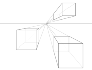
Oliver Harrison, One-point perspective with horizon and vanishing point

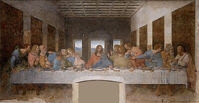
Leonardo da Vinci, The Last Supper, 1498, fresco, Santa Maria della Grazie, Milan, Italy
One-point perspective occurs when the receding lines appear to converge at a single point on the horizon and used when the flat front of an object is facing the viewer. Note: Perspective can be used to show the relative size and recession into space of any object, but is most effective with hard-edged three-dimensional objects such as buildings.
A classic Renaissance artwork using one point perspective is da Vinci’s ‘”The Last Supper”‘ fresco. Da Vinci composes the work by locating the vanishing point directly behind the head of Christ, thus drawing the viewer’s attention to the center. His arms mirror the receding wall lines, and, if we follow them as lines, would converge at the same vanishing point.

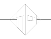
Oliver Harrison, Two-point perspective with horizon and vanishing points
Two-point perspective occurs when the vertical edge of a cube is facing the viewer, exposing two sides that recede into the distance, one to each vanishing point.
Gustave Caillebotte’s Paris Street in Rainy Weather uses two-point perspective to give an accurate view to an urban scene. The artist’s composition, however, is more complex than just his use of perspective. The figures are deliberately placed to direct the viewer’s eye from the front right of the picture to the building’s front edge on the left, which, like a ship’s bow, acts as a cleaver to plunge both sides toward the horizon. In the midst of this visual recession a lamp post stands firmly in the middle to arrest our gaze from going right out the back of the painting. Caillebotte includes the little metal arm at the top right of the post to direct us again along a horizontal path, now keeping us from traveling off the top of the canvas. As relatively spare as the left side of the work is, the artist crams the right side with hard-edged and organic shapes and forms in a complex play of positive and negative space.

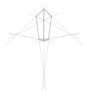
Oliver Harrison, Three-point perspective (with vanishing points above and below the horizon line shown at the same time)

Third Court of the Topkapi Palace, from the Hunername, 1548, Ottoman miniature painting, Topkapı Sarayı Müzesi, Istanbul
Three-point perspective is used when an artist wants to project a “bird’s eye view”, that is, when the projection lines recede to two points on the horizon and a third either far above or below the horizon line. In this case the parallel lines that make up the sides of an object are not parallel to the edge of the ground the artist is working on (paper, canvas, etc).
The perspective system is a cultural convention well suited to a traditional western European idea of the ‘truth’, that is, an accurate, clear rendition of observed reality. Even after the invention of linear perspective, many cultures traditionally use a flatter pictorial space, relying on overlapped shapes or size differences in forms to indicate this same truth of observation. Examine the miniature painting of the Third Court of the Topkapi Palace from 14th century Turkey to contrast its pictorial space with that of linear perspective. It’s composed from a number of different vantage points (as opposed to vanishing points), all very flat to the picture plane. While the overall image is seen from above, the figures and trees appear as cutouts, seeming to float in mid air. Notice the towers on the far left and right are sideways to the picture plane. As ‘incorrect’ as it looks, the painting gives a detailed description of the landscape and structures on the palace grounds.
After nearly five hundred years using linear perspective, western ideas about how space is depicted accurately in two dimensions went through a revolution at the beginning of the 20th century. A young Spanish artist, Pablo Picasso, moved to Paris, then western culture’s capital of art, and largely reinvented pictorial space with the invention of Cubism, ushered in dramatically by his painting Les Demoiselles d’Avignon in 1907. He was influenced in part by the chiseled forms, angular surfaces and disproportion of African sculpture (refer back to the Male figure from Cameroon) and mask-like faces of early Iberian artworks.
Introduction
Space is the empty area surrounding real or implied objects. Humans categorize space: there is outer space, that limitless void we enter beyond our sky; inner space, which resides in people’s minds and imaginations, and personal space, the important but intangible area that surrounds each individual and which is violated if someone else gets too close. Pictorial space is flat, and the digital realm resides in cyberspace. Art responds to all of these kinds of space.
Perspective
Clearly artists are as concerned with space in their works as they are with, say, color or form. There are many ways for the artist to present ideas of space. Remember that many cultures traditionally use pictorial space as a window to view realistic subject matter through, and through the subject matter they present ideas, narratives and symbolic content. The innovation of linear perspective, an implied geometric pictorial construct dating from 15th century Europe, affords us the accurate illusion of three-dimensional space on a flat surface, and appears to recede into the distance through the use of a horizon line and vanishing points.
One-point perspective occurs when the receding lines appear to converge at a single point on the horizon and used when the flat front of an object is facing the viewer. Note: Perspective can be used to show the relative size and recession into space of any object, but is most effective with hard-edged three-dimensional objects such as buildings.
A classic Renaissance artwork using one point perspective is da Vinci’s ‘”The Last Supper”‘ fresco. Da Vinci composes the work by locating the vanishing point directly behind the head of Christ, thus drawing the viewer’s attention to the center. His arms mirror the receding wall lines, and, if we follow them as lines, would converge at the same vanishing point.
Two-point perspective occurs when the vertical edge of a cube is facing the viewer, exposing two sides that recede into the distance, one to each vanishing point.
Gustave Caillebotte’s Paris Street in Rainy Weather uses two-point perspective to give an accurate view to an urban scene. The artist’s composition, however, is more complex than just his use of perspective. The figures are deliberately placed to direct the viewer’s eye from the front right of the picture to the building’s front edge on the left, which, like a ship’s bow, acts as a cleaver to plunge both sides toward the horizon. In the midst of this visual recession a lamp post stands firmly in the middle to arrest our gaze from going right out the back of the painting. Caillebotte includes the little metal arm at the top right of the post to direct us again along a horizontal path, now keeping us from traveling off the top of the canvas. As relatively spare as the left side of the work is, the artist crams the right side with hard-edged and organic shapes and forms in a complex play of positive and negative space.
Three-point perspective is used when an artist wants to project a “bird’s eye view”, that is, when the projection lines recede to two points on the horizon and a third either far above or below the horizon line. In this case the parallel lines that make up the sides of an object are not parallel to the edge of the ground the artist is working on (paper, canvas, etc).
The perspective system is a cultural convention well suited to a traditional western European idea of the ‘truth’, that is, an accurate, clear rendition of observed reality. Even after the invention of linear perspective, many cultures traditionally use a flatter pictorial space, relying on overlapped shapes or size differences in forms to indicate this same truth of observation. Examine the miniature painting of the Third Court of the Topkapi Palace from 14th century Turkey to contrast its pictorial space with that of linear perspective. It’s composed from a number of different vantage points (as opposed to vanishing points), all very flat to the picture plane. While the overall image is seen from above, the figures and trees appear as cutouts, seeming to float in mid air. Notice the towers on the far left and right are sideways to the picture plane. As ‘incorrect’ as it looks, the painting gives a detailed description of the landscape and structures on the palace grounds.
After nearly five hundred years using linear perspective, western ideas about how space is depicted accurately in two dimensions went through a revolution at the beginning of the 20th century. A young Spanish artist, Pablo Picasso, moved to Paris, then western culture’s capital of art, and largely reinvented pictorial space with the invention of Cubism, ushered in dramatically by his painting Les Demoiselles d’Avignon in 1907. He was influenced in part by the chiseled forms, angular surfaces and disproportion of African sculpture (refer back to the Male figure from Cameroon) and mask-like faces of early Iberian artworks.
Picasso and Cubism
Use the following links to learn more about:
For more information about the importance of Les Demoiselles d’Avignon, listen to this question and answer session available from the Metropolitan Museum of Art in New York City:
Picasso, his friend Georges Braque George Braque Castle at La Roche Guyon 1909 Oil on canvas and a handful of other artists struggled to develop a new space that relied on, ironically,
the flatness of the picture plane to carry and animate traditional subject matter including figures, still life and landscape. Cubist pictures, and eventually sculptures, became amalgams of different points of view, light sources and planar constructs. It was as if they were presenting their subject matter in many ways at once, all the while shifting foreground, middle ground and background so the viewer is not sure where one starts and the other ends. In an interview, Picasso explained Cubism this way: “The problem is now to pass, to go around the object, and give a plastic expression to the result. All of this is my struggle to break with the two-dimensional aspect.”[1] Public and critical reaction to Cubism was understandably negative, but the artists’ experiments with spatial relationships reverberated with others and became – along with new ways of using color – a driving force in the development of a modern art movement that based itself on the flatness of the picture plane. Instead of a window to look into, the flat surface becomes a ground on which to construct formal arrangements of shapes, colors and compositions. For another perspective on this issue review the section on abstraction in the Art definitions, artistic roles and visual thinking learning pathway.
You can see the radical changes Cubism made in George Braque’s landscape Castle at La Roche Guyon from 1909. The trees, houses, castle and surrounding rocks comprise almost a single complex form, stair-stepping up the canvas to mimic the distant hill at the top, all of it struggling upwards and leaning to the right within a shallow pictorial space. As the cubist style developed, its forms became even flatter. Juan Gris’s The Sunblind from 1914 splays the still life it represents across the canvas. Collage elements like newspaper reinforce pictorial flatness.
It’s not so difficult to understand the importance of this new idea of space when placed in the context of comparable advances in science surrounding the turn of the 19th century. The Wright Brothers took to the air with powered flight in 1903, the same year Marie Curie won the first of two Nobel prizes for her pioneering work in radiation. Sigmund Freud’s new ideas on the inner spaces of the mind and its effect on behavior were published in 1902, and Albert Einstien’s calculations on relativity, the idea that space and time are intertwined, first appeared in 1905. Each of these discoveries added to human understanding and realigned the way we look at ourselves and our world. Indeed, Picasso, speaking of his struggle to define Cubism, said “Even Einstein did not know it either! The condition of discovery is outside ourselves; but the terrifying thing is that despite all this, we can only find what we know”.[2]
Three-dimensional space doesn’t undergo this fundemental transformation. It remains a visual tug between positive and negative spaces. Sculptors influenced by Cubism do, however, develop new forms to fill this space; abstract and non-objective works that challenge us to see them on their own terms. Constantin Brancusi, a Romanian sculptor living in Paris, became a leading artist to champion the new forms of modern art. His sculpture Bird in Space is an elegant example of how abstraction and formal arrangement combine to symbolize the new movement. The photograph of Brancusi’s studio gives further evidence of sculpture’s debt to Cubism and the struggle “…to go around the object, to give a plastic expression….”[1]
Now that we’ve established line, shape, spatial relationships and mass, we can turn our attention to surface qualities and their importance in works of art. Value (or tone), color and texture are the elements used to do this.
What kind of space does Picasso create with the style called cubism? What is your personal opinion about this style?
You must be logged in to post to WEnotes.
Note: Your comment will be displayed in the course feed.
Notes
Content is available under the
Creative Commons Attribution Share Alike License.
Privacy Policy | Authors