Before we begin to analyse statistical data, we need to get comfortable with it. So at first, simply to describe the distribution of one variable at a time. This is also called univariate analysis.
Central Tendency
The central tendency of a variable is nothing more than its average value. There are, however, different kinds of averages: the mean, the median, and the mode.
The Mean
Also known as the “arithmetic mean,” this is probably what most of us think of when we use the term “average.” The mean value of a variable is calculated simply by adding up all the values and then dividing by the number of cases. The mean requires that data be at least interval [1] level. Take, for example, a variable with three cases having the values 2, 3, and 4 respectively. The mean for this variable would obviously be 3 (2+3+4=9; 9/3=3), but this makes no sense unless the difference between 2 and 3 is the same as the difference between 3 and 4.
In mathematical notation, the mean for population data is represented by the symbol μ (the lower case Greek letter mu). If we are using sample data, the mean (of a variable named X) is represented by the symbol \( \bar{X} \) (pronounced “X bar”).
The Median
The median is calculated by ranking cases from high to low (or vice-versa) and then finding the value of the case that is in the middle (also called the 50th percentile) of the distribution. By definition, half of all cases are at or above the median, and half below. In a distribution of 21 cases, for example, the median value is the value of the 11th highest case, since there are 10 cases with higher values and 10 cases with lower values. If there is an even number of cases, the median value is the value half way between the values of the two cases closest to the middle. For example, in a distribution of 20 cases, the median value is half way between the values of the 10th and 11th highest cases.
The notion of a “middle” case makes sense only if cases can be rank-ordered. Calculation of a median, therefore, requires at least ordinal level data. Sometimes, it makes sense to calculate a median instead of, or in addition to, a mean even with interval or ratio data. If the distribution of the values of a variable is heavily “skewed” by a few very high or very low scores, the mean of the distribution will be misleading. Suppose, for example, that there are 100 households in your neighborhood, and that both their mean and the median household incomes are about $50,000 per year. Now suppose that Bill Gates and his family move in next door. The median household income will not change much (now that the neighborhood contains 101 families, it will be the income of the family ranked 51st), but the mean household income will be in the hundreds of millions of dollars. Which figure better describes the “average” family in the neighborhood?
The Mode
The mode of a variable is the value that occurs most frequently. In the Australia, the modal ancestry is English (36.1%) and the modal gender is female (100 females for every 99.1 males)[1]. In an election, the modal candidate is the one who receives more votes than anyone else. In politics, a mode is often referred to as a “plurality.” It can be used with any level of measurement.
Sometimes the question of which measure of central tendency is used can be a hot political topic. For example, measuring economic prosperity by looking at the mean wage can be heavily skewed by high wages of executives, whereas modal wages provide a more realistic picture of the situation of the working class.
Dispersion
In addition to the average value of a variable, we also want to know how spread out the values are: their dispersion. The range (the difference between the maximum and minimum values) gives an indication, but it is only a very limited indication. There are some other, more useful, measures.
The Variance and the Standard Deviation
The variance and the standard deviation are related measures of how spread out the values of a variable are from the mean. Just like the mean requires at least interval level measurement, so do the variance and the standard deviation.
Let’s have a look at an example. Have a look at the two sets of numbers shown below. Both have the same mean (10), but the numbers on the right are clearly more spread out than those on the left.
| Table 1: Example of variance difference
|
| Set 1
|
Set 2
|
| 12
|
14
|
| 11
|
12
|
| 10
|
10
|
| 9
|
8
|
| 8
|
6
|
Table 1 shows two examples of variance. Table 2 shows an example of how the variance in the group of numbers on the left is calculated. In the first column, the individual values of the variable (which we will represent with the symbol “Xi”) are listed. In the second column, the “deviation” from the mean value (here we’ll use the symbol for the population mean, or µ) of 10 is subtracted from each value. If we simply took an average of the deviations, the result would always be zero. Instead, in the third column we square the deviations from the mean. Finally we sum (\(\sum\), the upper-case Greek letter sigma) these individual numbers from the first through the last, or nth \( (\sum_{i=1}^N ) \) and divide by the number of cases (5). The result is the “mean squared deviation from the mean,” or the variance. For population data, the variance [2] is represented by the symbol σ2 (the square of the lower-case Greek letter sigma) for population data, and s2 for sample data.
| Table 2: Calculating variance
|
| Xi
|
Xi – \( μ \)
|
(Xi – \( μ \))2
|
| 12
|
2
|
4
|
| 11
|
1
|
1
|
| 10
|
0
|
0
|
| 9
|
-1
|
-1
|
| 8
|
-2
|
4
|
| \(\dfrac {\sum_{i=1}^N (X_{i} – μ)^2}{N} = 10/5 = 2 \)
|
The standard deviation (σ for population data, s for sample data), like the variance, is a measure of dispersion, and is the one usually reported. It is simply the positive square root of the variance. In the above example, \( σ = \sqrt {2} = 1.41 \)
The variance and the standard deviation are usually not of great interest in and of themselves. They are, however, central to a wide variety of other statistical methods. Occasionally, they do have direct application. Beck, for example, demonstrates the nationalization of American politics during the Twentieth Century by showing that the standard deviation in presidential vote by state declined fairly steadily between 1896 and 1992. [3]
If you want to learn more about standard variation, check out this video from Khan Academy.
Boxplots
A boxplot (also known as a box and whiskers plot) is another way of examining the distribution of a continuous variable.
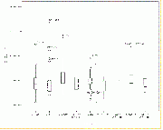
Figure A shows a boxplot for educational expenditures as a percent of Gross Domestic Product (GDP) of various countries.
Boxplot illustration for research methods subject
The “box” in the figure shows the ‘interquartile range’. That is, the line at the top of the box represents the value of the 75th percentile, while the line at the bottom of the box represents the value of the 25th percentile. In other words, the middle half of all counties are within the box. The value of the 50th percentile (that is, of the median value) is represented by the horizontal line within the box. The lines extending from the box are the “whiskers,” and the horizontal lines at the end of the whiskers represent the highest and lowest values that are outside the box but within 1.5 times the inter-quartile range (1.5*IQR). The circles beyond the whiskers represent “outliers,” that is, cases outside the box by more than 1.5*IQR, while asterisks represent “extreme outliers,” that is, those outside the box by more than 3*IQR. We’ll take up this subject again in the next chapter when we discuss the normal distribution. Note for now that there are several outliers and two extreme outliers (Timor-Leste and Cuba).
Figure B shows the distribution of the same variable, but this time broken down by region. Here we can see that, as a percent of GDP, educational expenditures don’t vary much by region. Within most regions, however, there are outliers or extreme outliers, that is, countries that spend a much larger or smaller share of their GDP on education than do other countries in the same region.
Download the image: //wikieducator.org/images/0/0f/FigureB-boxplots2.gif
Boxplot illustration for research methods subject
Key points
Descriptive statistics: key terms
- Boxplot or box and whiskers plot – a chart for examining the distribution of a continuous variable
- Dispersion – how spread out the values of a continuous variable are.
- Inter quartile range – The range between the 25th and the 75th percentile of of a continuous variable
- Mean – Also called ‘average’. Calculated simply by adding up all the values and then dividing by the number of cases.
- Median – Calculated by ranking cases from high to low (or vice-versa) and then finding the value of the case that is in the middle (also called the 50th percentile) of the distribution.
- Mode – The value that occurs most frequently.
- Standard deviation – a measure of how spread out the values of a variable are from the mean.
- Variance – a measure of how spread out the values of a variable are from the mean.
Activities: find descriptive statistics
- Find each of the descriptive statistical terms reported in academic journal articles
- Upload a screen shot of one of these pictures to the discussion forum
- Describe what point it was used to prove/illustrate/show.
Notes
- ↑ Sometimes, in addition to being ordered, the differences (or intervals) between any two adjacent values on a measurement scale are the same. For example, the difference in temperature between 80 degrees Fahrenheit and 81 degrees is the same as that between 90 degrees and 91 degrees. When each interval represents the same increment of the thing being measured, the measure is called an interval variable.
- ↑ The formula for the population variance is \( \sigma^2 = \dfrac {\sum_{i=1}^N (X_i – \mu)^2;}{N} \)
- ↑ Richard M. Scammon and Ben J. Wattenberg, The Real Majority (N.Y.: Coward-McCann, 1970), 70
Credits
John L. Korey 2013, POLITICAL SCIENCE AS A SOCIAL SCIENCE, Introduction to Research Methods in Political Science:
The POWERMUTT* Project, [2]
Before we begin to analyse statistical data, we need to get comfortable with it. So at first, simply to describe the distribution of one variable at a time. This is also called univariate analysis.
Central Tendency
The central tendency of a variable is nothing more than its average value. There are, however, different kinds of averages: the mean, the median, and the mode.
The Mean
Also known as the “arithmetic mean,” this is probably what most of us think of when we use the term “average.” The mean value of a variable is calculated simply by adding up all the values and then dividing by the number of cases. The mean requires that data be at least interval [1] level. Take, for example, a variable with three cases having the values 2, 3, and 4 respectively. The mean for this variable would obviously be 3 (2+3+4=9; 9/3=3), but this makes no sense unless the difference between 2 and 3 is the same as the difference between 3 and 4.
In mathematical notation, the mean for population data is represented by the symbol μ (the lower case Greek letter mu). If we are using sample data, the mean (of a variable named X) is represented by the symbol \( \bar{X} \) (pronounced “X bar”).
The Median
The median is calculated by ranking cases from high to low (or vice-versa) and then finding the value of the case that is in the middle (also called the 50th percentile) of the distribution. By definition, half of all cases are at or above the median, and half below. In a distribution of 21 cases, for example, the median value is the value of the 11th highest case, since there are 10 cases with higher values and 10 cases with lower values. If there is an even number of cases, the median value is the value half way between the values of the two cases closest to the middle. For example, in a distribution of 20 cases, the median value is half way between the values of the 10th and 11th highest cases.
The notion of a “middle” case makes sense only if cases can be rank-ordered. Calculation of a median, therefore, requires at least ordinal level data. Sometimes, it makes sense to calculate a median instead of, or in addition to, a mean even with interval or ratio data. If the distribution of the values of a variable is heavily “skewed” by a few very high or very low scores, the mean of the distribution will be misleading. Suppose, for example, that there are 100 households in your neighborhood, and that both their mean and the median household incomes are about $50,000 per year. Now suppose that Bill Gates and his family move in next door. The median household income will not change much (now that the neighborhood contains 101 families, it will be the income of the family ranked 51st), but the mean household income will be in the hundreds of millions of dollars. Which figure better describes the “average” family in the neighborhood?
The Mode
The mode of a variable is the value that occurs most frequently. In the Australia, the modal ancestry is English (36.1%) and the modal gender is female (100 females for every 99.1 males)[1]. In an election, the modal candidate is the one who receives more votes than anyone else. In politics, a mode is often referred to as a “plurality.” It can be used with any level of measurement.
Sometimes the question of which measure of central tendency is used can be a hot political topic. For example, measuring economic prosperity by looking at the mean wage can be heavily skewed by high wages of executives, whereas modal wages provide a more realistic picture of the situation of the working class.
Dispersion
In addition to the average value of a variable, we also want to know how spread out the values are: their dispersion. The range (the difference between the maximum and minimum values) gives an indication, but it is only a very limited indication. There are some other, more useful, measures.
The Variance and the Standard Deviation
The variance and the standard deviation are related measures of how spread out the values of a variable are from the mean. Just like the mean requires at least interval level measurement, so do the variance and the standard deviation.
Let’s have a look at an example. Have a look at the two sets of numbers shown below. Both have the same mean (10), but the numbers on the right are clearly more spread out than those on the left.
Table 1 shows two examples of variance. Table 2 shows an example of how the variance in the group of numbers on the left is calculated. In the first column, the individual values of the variable (which we will represent with the symbol “Xi”) are listed. In the second column, the “deviation” from the mean value (here we’ll use the symbol for the population mean, or µ) of 10 is subtracted from each value. If we simply took an average of the deviations, the result would always be zero. Instead, in the third column we square the deviations from the mean. Finally we sum (\(\sum\), the upper-case Greek letter sigma) these individual numbers from the first through the last, or nth \( (\sum_{i=1}^N ) \) and divide by the number of cases (5). The result is the “mean squared deviation from the mean,” or the variance. For population data, the variance [2] is represented by the symbol σ2 (the square of the lower-case Greek letter sigma) for population data, and s2 for sample data.
The standard deviation (σ for population data, s for sample data), like the variance, is a measure of dispersion, and is the one usually reported. It is simply the positive square root of the variance. In the above example, \( σ = \sqrt {2} = 1.41 \)
The variance and the standard deviation are usually not of great interest in and of themselves. They are, however, central to a wide variety of other statistical methods. Occasionally, they do have direct application. Beck, for example, demonstrates the nationalization of American politics during the Twentieth Century by showing that the standard deviation in presidential vote by state declined fairly steadily between 1896 and 1992. [3]
If you want to learn more about standard variation, check out this video from Khan Academy.
Boxplots
A boxplot (also known as a box and whiskers plot) is another way of examining the distribution of a continuous variable.
Figure A shows a boxplot for educational expenditures as a percent of Gross Domestic Product (GDP) of various countries.
The “box” in the figure shows the ‘interquartile range’. That is, the line at the top of the box represents the value of the 75th percentile, while the line at the bottom of the box represents the value of the 25th percentile. In other words, the middle half of all counties are within the box. The value of the 50th percentile (that is, of the median value) is represented by the horizontal line within the box. The lines extending from the box are the “whiskers,” and the horizontal lines at the end of the whiskers represent the highest and lowest values that are outside the box but within 1.5 times the inter-quartile range (1.5*IQR). The circles beyond the whiskers represent “outliers,” that is, cases outside the box by more than 1.5*IQR, while asterisks represent “extreme outliers,” that is, those outside the box by more than 3*IQR. We’ll take up this subject again in the next chapter when we discuss the normal distribution. Note for now that there are several outliers and two extreme outliers (Timor-Leste and Cuba).
Figure B shows the distribution of the same variable, but this time broken down by region. Here we can see that, as a percent of GDP, educational expenditures don’t vary much by region. Within most regions, however, there are outliers or extreme outliers, that is, countries that spend a much larger or smaller share of their GDP on education than do other countries in the same region.
Download the image: //wikieducator.org/images/0/0f/FigureB-boxplots2.gif
Key points
Descriptive statistics: key terms
Activities: find descriptive statistics
Notes
Credits
John L. Korey 2013, POLITICAL SCIENCE AS A SOCIAL SCIENCE, Introduction to Research Methods in Political Science:
The POWERMUTT* Project, [2]
Content is available under the
Creative Commons Attribution Share Alike License.
Privacy Policy | Authors